Monday, February 7, 2011
Map of US Farmers' Markets
NOTE: You may have to zoom in/out to get points to load. The map will only load 500 points at a time and is a bit quirky about paging data.
Wednesday, July 21, 2010
Thursday, July 1, 2010
We OPML'd the DoD
I'm just giddy about this. We OPML'd the DoD. Specifically, we published OPML for Joint Capability Areas. It turned out to be so easy, too. I wish I could easily convey the significance of this achievement.
JCA's are an exhaustive military taxonomy declaring hundreds of defined military capabilities. They are predominantly referenced in decision making for acquisitions and planning. All over the military there are organizations who are required to map every aspect of their existences to JCAs or else be denied resources. Consequently, nearly every “decision support” and “business intelligence” tool under the sun (there are hundreds, if not thousands of them; costing tens, if not hundreds, of millions) has a requirement for mapping JCAs. Just this week (in fact, after we decided to do this) one of our teams received a requirement to add JCA mappings in a database. The first question that came to my mind was, "how are they going to get that data into the system?"
You see, JCAs are published in formats that are only readable by people, and not in formats that can be used by tools. As a result, people repeatedly spend unnecessary time manually keying in JCAs just so they can be available for menu items, pick lists, and other input forms in their software applications. This is inefficient, error prone, and easily solved by publishing JCAs in Outline Processor Markup Language
You see, JCAs are published in formats that are only readable by people, and not in formats that can be used by tools. As a result, people repeatedly spend unnecessary time manually keying in JCAs just so they can be available for menu items, pick lists, and other input forms in their software applications. This is inefficient, error prone, and easily solved by publishing JCAs in Outline Processor Markup Language
So that's what we did.
Now system integrators can consume a URL-addressable, well-formed, hierarchical, text document as input to their application development. No more need to manually key stuff. No more typos. Point any developer worth his/her salt as this URL and they will be off to the races.
Credit where it is due:
Our (2nd) wonderful co-op student from Rochester Institute of Technology, Ben Kaiser wrote the code. Longtime Bridgeborner, Rob Shell shared some SME-ness and was Johnny-on-the-Spot with this (mostly well-formed) HTML version of the JCAs. Thanks also to Sunlight Labs for feedback on choosing the right technology to get the job done. Raymond Yee provided an excellent model for us to follow (in response to this project idea from Clay Johnson).
Sunday, June 27, 2010
Questions I Should Be Able to Ask My City (On the Web)
It's too hard to ask a simple question about a city and get a simple answer.
This notion goes well beyond satisfying the need to know the answers. Our inability to ask basic questions about any city and provide simple answers is a much more profound shortcoming compared to just the answers themselves. Simple answers to basic questions are the foundational elements of more complex analyses.
When we rely on experts and representatives, elected or otherwise, to perform these analyses we expect accuracy and completeness. But how is this measured? No matter what the field of study, the answer has always been references, data sets, and peer review.
Today, especially in matters of public interest, the word "peer" is hard to define. All the more reason why satisfying the first two elements, references and data sets, is of paramount importance.
Cities should provide simple answers to basic questions.
Cities should provide simple answer to basic questions in a URL-addressable, well-formed, text format.
There are many mechanisms cities can use to satisfy this requirement; Web API, online spreadsheet, posted XML documents. Ideally, technology exists and can be integrated so that cities can answer questions via several of these mechanisms.
So what are the questions we would ask our cities, if we could? Following are a few to which I would like to know the answers. Moreover, given the answers to these questions in URL-addressable, well-formed, text format(s) the answers to these questions could make for some rather interesting, useful mash-ups.
- Where is the location of each road and intersection under construction in my city?
- How long has road/intersection X been under construction?
- When will road/intersection X construction project be complete?
- What is the list of each building construction permit in my city?
- Where is the location of each building construction permit in my city?
- What is the list of businesses that pay taxes in my city?
- What is the list of businesses that pay taxes in my city, by type of business?
- What is the list of how much each business paid in taxes in my city?
- Where is the location of each business that pays taxes in my city?
- What is the list of neighborhoods in my city?
- How many houses are in each neighborhood in my city?
- What is the list of schools in the city? (This should include private and church schools, too, if these schools are required to be registered with the city.)
- What is the location of each school in my city?
- What is the enrollment at each school in my city?
- How many cars are registered in my city?
- What is the list of most traveled streets in my city?
- What is the list of traffic accidents in my city?
- Where are the locations of each traffic accident in my city?
- How many pounds of garbage are collected in my city?
- How many pounds of garbage are collected in my city, by zipcode?
- How many pounds of garbage are collected in my city, by neighborhood?
- What is the list of events in my city?
- When are events occurring in my city, by time period?
- Where are events occurring in my city?
- What is the list of conditional use permits in my city?
- What is the list of all emergency response stations (fire, police, medical) in my city?
- Where are the locations of each emergency response station in my city?
- What is the number of emergency calls in my city, by time period?
- What is the list of stations responding to emergency calls, by time period?
- What is the frequency of emergency calls by station and time period?
[To be continued...]
Without a doubt, this list is far from exhaustive. Crime data is one of the most popular and reported-on data sets. I tried to come up with relevant questions for which data are not likely accessible. Certainly, schema are required for declaring the answers to these questions in our required format. Probably every question does not have to be anticipated a priori. We should also not assume that a particular question implies a specific data set. We often can easily get the answer of, for example, the location of each crime. Rarely, however, can we get aggregate data, useful in trend analyses. Perhaps what we need are structured data sets and Wolfram Alpha. In any case, a foundational platform of data is required. In any case, we should be able to formulate a basic question and get a simple answer (on the Web).
Given the simplicity of what is being asked, however, this should not be complicated.
Transparency and Visualization of City Data
Last year my city was considering closing one or two schools (HamptonRoads.com, WAVY.com). One of the justifications cited was decline in student enrollment. Though I can no longer find it anywhere online, one of the enrollment artifacts put forth was this image of a column chart from a (presumably) Excel spreadsheet.
 |
| From Flow |
To look at this picture (of data) one would assume there was a HUGE drop in enrollment, something in the vicinity of 50-60%.
But a closer look at the values reveals quite a different quantitative result. In fact, the actual decline from the peak in 1994-95 to the valley in 2008-09 appears to be 5,600 students. Keep in mind, I'm doing my best to derive the actual number based on the Y-axis scale on the picture. The data weren't provided. To make matters more difficult, the column chart is shown in 3D. This undermines the utility of the visualization by making it hard to determine an actual value on the chart.
The actual difference is 6,824 students, from the high in 1994-95 to the projected low in 2012-13.
6,824 students is 18.1% of the peak (6,824/37,707). While significant, 18.1% is a far cry from what appears to be a 50-60% decline.
Fortunately, when I requested the data they were provided to me.
This is valuable for two reasons. First and foremost, I get the data, not an interpretation of the
data. Second, and more the point of this post, I can show what this chart should look like and what else the data have to say.

Notice the slope of the decline and the differences between yearly observations. Neither are so exaggerated as the first image.
The differences in view are the aspect ratio of the graph and the value of the Y-axis origin. In the first chart the aspect ratio of the picture is nearly square, or 1:1. The starting value of the Y-axis is 28000 (an arbitrary value not found anywhere in the data). In the second chart the Y-axis begins at zero (0) and the aspect ratio is closer to 3:1 (which is probably too wide).
So then, which image and which set of chart variables is correct?
The answer depends on the basis for the query...or what you are trying to say. Actually the answer has nothing to do with "what you are trying to say" since you/we shouldn't be trying to say anything except to represent quantitative values in visual form. The right thing is to understand the nature of the analysis and the decision trying to be made.
In this case, we can assume with confidence that the Y-axis has no business starting at any value other than zero. In this case what is being claimed, via what is shown, is a long term (since 1990) decline, not a year-to-year fluctuation. Over the 14 year span the decline is obviously not in the range of 50-60%, therefore the chart should no imply so. Otherwise, if year-to-year deltas are of interest it probably does not make sense to show a 14 year span.
By the way, the data for recent yearly decline are -216, -200, +30, -17 between the years 2006-2010. 200 students city wide is hardly justification for closing a school. (Our school has over 600 students.)
In the end, my city chose not to close a school. I think that was a wise choice. But I have to wonder what was going on in the minds of the decision makers. What analyses were they using? Did they, too, realize the truth in these numbers or was it some other (political) factor. Did we just get lucky?
When cities make claims based on data they should publish the data. When cities, or anyone, shows you a picture of data you should question the picture and demand politely request a reference to the data. At minimum, know what you are seeing.
Thursday, June 24, 2010
Mashing up Hampton Roads School System Data
I'm tempted to not provide a narrative for this. The pictures really tell the story.
I was reading an article from my local "paper," The Virginian-Pilot, online. When I finished the article I noticed the "Quick Links" just below. To my pleasant surprise, the first category of links was "Databases." Truth be told, I'm not that surprised to find data at The Pilot, but what unfolded when I followed that link was far from the norm when it comes to online (local) journalism and data.
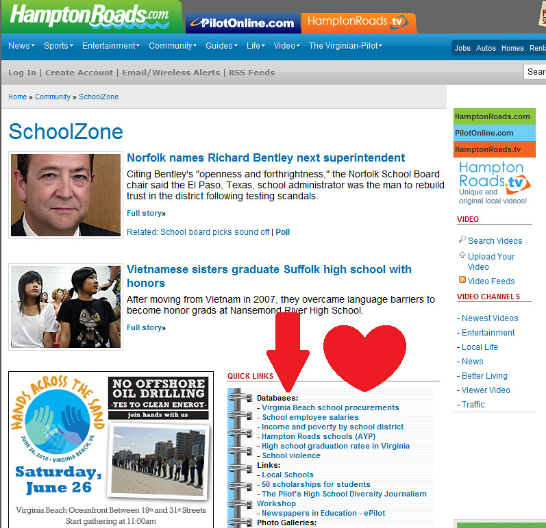
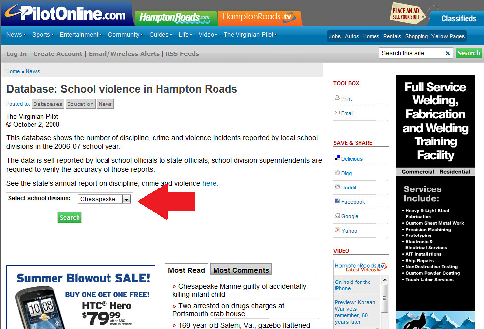
I clicked the link to "School Violence" and found the following page. If you look closely you will see there is a form:
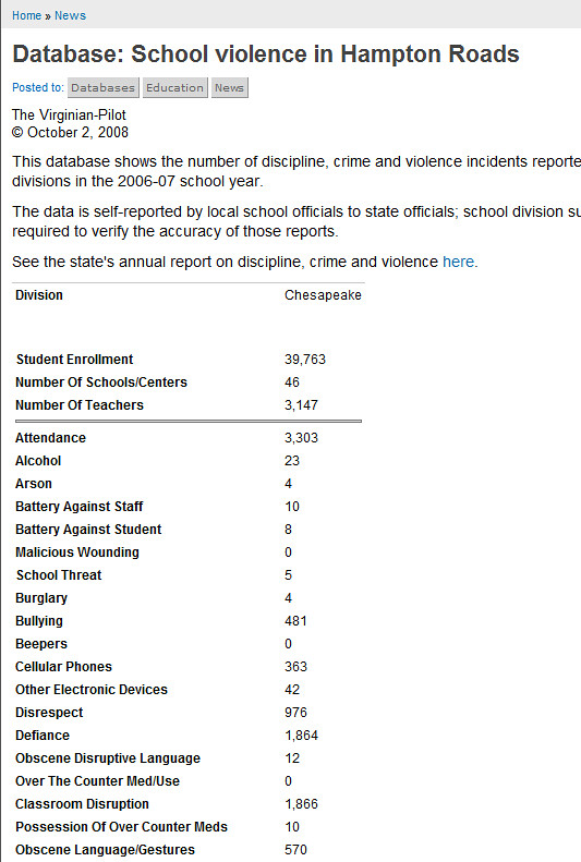
Lo and behold... In about 20 minutes I had pasted all of the contents of the database into a Google spreadsheet:
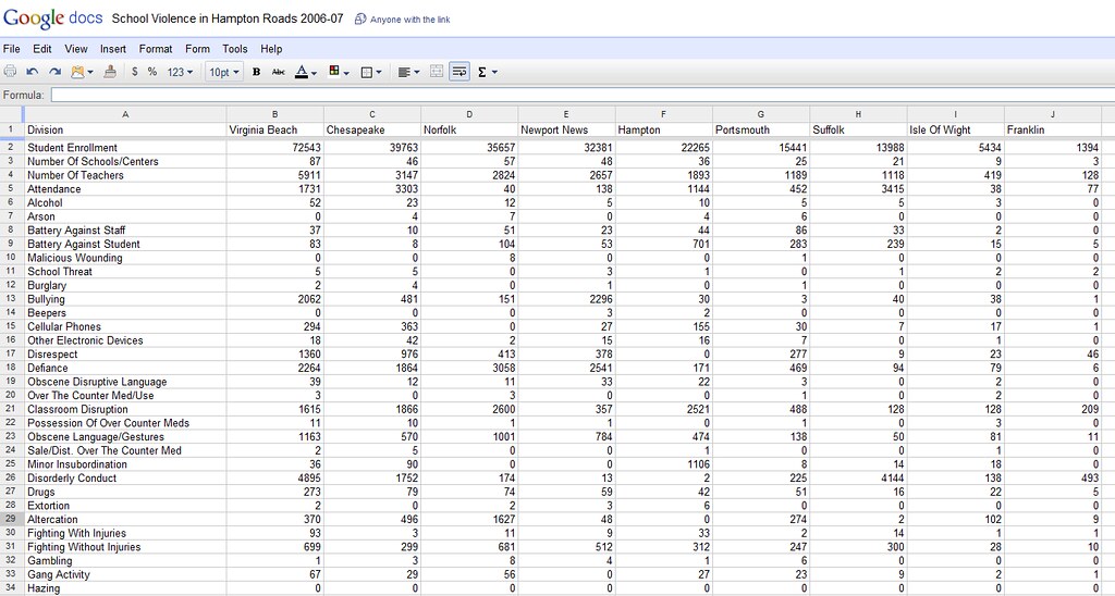
From there I was able to create a few transformations of the data and about a half-dozen meaningful charts like this: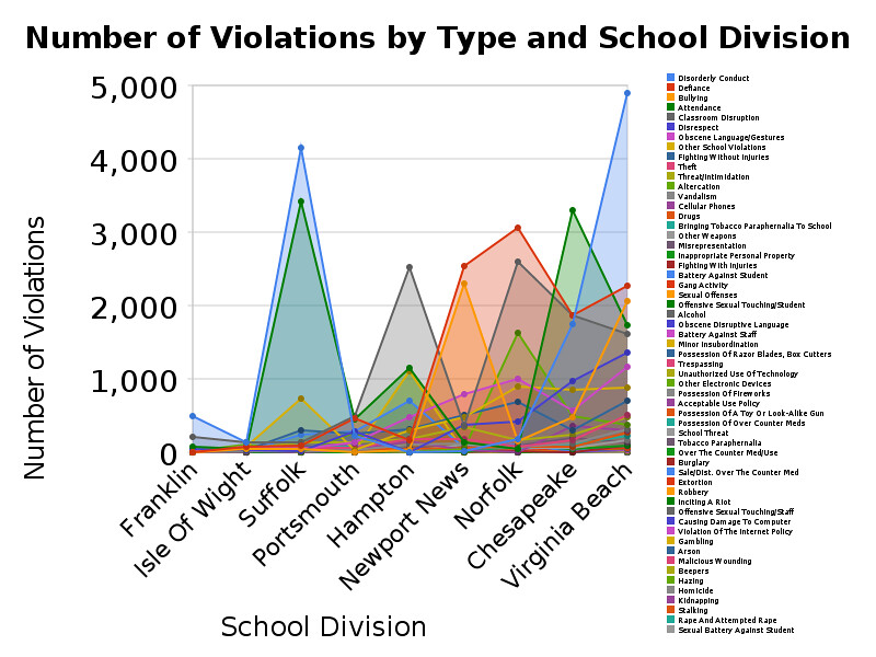
What if more news organizations published databases? What if journalists had a habit of digging into those databases with with these simple tools? Would we create better news products? Would we become more accurately and insightfully informed as citizens? Would our governments, businesses, and civic organizations make wiser strategy and better decisions? And if we think that the answer to any of these questions is yes, how do we sustain the "model?"
Monday, March 29, 2010
Transparency and the Digital Divide
As I start this post I'm on the Orange line of the Metro heading home from Transparency Camp 2010. I timed my arrival almost exactly with that of the train using an iPhone app. Now I'm typing on a super-powerful laptop with a huge display. Many Metro stations have 3G access and even though I don't tether my phone to my computer to use 3G on my laptop, I'm sure it can be done. I have nearly all of the comforts of the digital age at my disposal nearly all of the time.
I often use these tools to stay in touch with what is happening in and around my community, my local and state governments, and the federal government. I use access to Web sites, data, and social networks to stay informed and engaged. These tools offer me many choices of how much info I want to consume and how much I feel like engaging.
But what can people who don't have these resources do to be informed and participate? What choices do they have for receiving information and offering feedback? So much of Gov 2.0 and open government relates to the Web that we must be careful not to exclude those who lack digital resources.
This topic came up in multiple sessions at Transparency Camp and we generated some good ideas (we think) on how to address this issue responsibly. One idea in particular that resonated was placing LED message boards around town to broadcast key indicators, initiatives, and citizen feedback.
The basic idea is to place LED signs at heavily trafficked locations. These signs would display information about the city in which people are most interested. Some of this content would be generated the city and some of the content would be generated by citizens. Information, especially that generated by citizens, would vary somewhat by neighborhood.
On the participation side of the conversation the minimum barrier to entry would be a mobile phone. Anyone who can send a text message can contribute. Of course, there would be other ways to contribute. On the information side of the equation would be these message boards.
This would be a way for people to simultaneously tell their city what they want and to see what the city is getting by way of feedback.
There is plenty of reason to think this can be effective, too.
But before I go on, I need to add some context. This all came up during a session I facilitated called "Local Government Transparency." In the beginning of the session I gave several examples of transparency happening at the local level. One example was Localocracy. Hart Rossman quickly pointed out that, while I'm able to easily cite these examples, most people hardly know what I'm even talking about. The point being: we need to make this relevant to the vast majority of people who aren't aware of what's going on in this space.
Keying on that, Bryan Sivak, CTO of Washington, D.C., shared with us his concerns about the "digital divide" in his city. In the poorest wards in D.C., broadband Internet access is about 30%. The point being: we can make all the cool open data and participation websites we want, but we won't be serving key constituencies in his city if those people can't access these online resources. After some back and forth a gentlemen, whose name regrettably escapes me at the moment made a reference that reminded me very much of "The Blackboard Blogger of Monrovia," Alfred Sirleaf. Alfred is not just dealing with a digital divide. He has customers who are not literate. Still, he manages to provide useful information about what matters around them.
At lesser extremes we see other examples of this idea already working. Metro transit signs are one great example.![]()
What else do people want to know about their city that can be easily provided on on a billboard in the public square?
It's worth noting that we don't necessarily need government to provide (and maintain) the billboard. Alfred Sirleaf makes a living doing what he does. People who visit his blackboard buy goods from him. We probably need government to issue permits for signs in public spaces. Then again, What if food vendors in D.C. hung LEDs on their carts?
We do need from government data that is open and accessible so that it can be easily used by anyone at low or no cost. Given this and a touch of inspiration from Alfred Sirleaf, maybe we can succeed at engaging citizens in their own government in ways that are widely accessible.
Post Script:
Gwynne Kostin pointed out the next day, that the digital divide is as much cultural as it is economical. There are plenty of people who aren't resource constrained who are nonetheless struggling with relevance of transparency and open government in their lives.
Thank you to Erik Hersman for the image of Alfred Sirleaf
Subscribe to:
Posts (Atom)