Showing posts with label education. Show all posts

Sunday, June 27, 2010

Transparency and Visualization of City Data

Last year my city was considering closing one or two schools (HamptonRoads.com, WAVY.com). One of the justifications cited was decline in student enrollment. Though I can no longer find it anywhere online, one of the enrollment artifacts put forth was this image of a column chart from a (presumably) Excel spreadsheet.


From Flow

To look at this picture (of data) one would assume there was a HUGE drop in enrollment, something in the vicinity of 50-60%.

But a closer look at the values reveals quite a different quantitative result. In fact, the actual decline from the peak in 1994-95 to the valley in 2008-09 appears to be 5,600 students. Keep in mind, I'm doing my best to derive the actual number based on the Y-axis scale on the picture. The data weren't provided. To make matters more difficult, the column chart is shown in 3D. This undermines the utility of the visualization by making it hard to determine an actual value on the chart.

The actual difference is 6,824 students, from the high in 1994-95 to the projected low in 2012-13.

6,824 students is 18.1% of the peak (6,824/37,707). While significant, 18.1% is a far cry from what appears to be a 50-60% decline.

Fortunately, when I requested the data they were provided to me.

This is valuable for two reasons. First and foremost, I get the data, not an interpretation of the
data. Second, and more the point of this post, I can show what this chart should look like and what else the data have to say.

Notice the slope of the decline and the differences between yearly observations. Neither are so exaggerated as the first image.

The differences in view are the aspect ratio of the graph and the value of the Y-axis origin. In the first chart the aspect ratio of the picture is nearly square, or 1:1. The starting value of the Y-axis is 28000 (an arbitrary value not found anywhere in the data). In the second chart the Y-axis begins at zero (0) and the aspect ratio is closer to 3:1 (which is probably too wide).

So then, which image and which set of chart variables is correct?

The answer depends on the basis for the query...or what you are trying to say. Actually the answer has nothing to do with "what you are trying to say" since you/we shouldn't be trying to say anything except to represent quantitative values in visual form. The right thing is to understand the nature of the analysis and the decision trying to be made.

In this case, we can assume with confidence that the Y-axis has no business starting at any value other than zero. In this case what is being claimed, via what is shown, is a long term (since 1990) decline, not a year-to-year fluctuation. Over the 14 year span the decline is obviously not in the range of 50-60%, therefore the chart should no imply so. Otherwise, if year-to-year deltas are of interest it probably does not make sense to show a 14 year span.

By the way, the data for recent yearly decline are -216, -200, +30, -17 between the years 2006-2010. 200 students city wide is hardly justification for closing a school. (Our school has over 600 students.)

In the end, my city chose not to close a school. I think that was a wise choice. But I have to wonder what was going on in the minds of the decision makers. What analyses were they using? Did they, too, realize the truth in these numbers or was it some other (political) factor. Did we just get lucky?

When cities make claims based on data they should publish the data. When cities, or anyone, shows you a picture of data you should question the picture and demand politely request a reference to the data. At minimum, know what you are seeing.

Thursday, June 24, 2010

Mashing up Hampton Roads School System Data

I'm tempted to not provide a narrative for this. The pictures really tell the story.

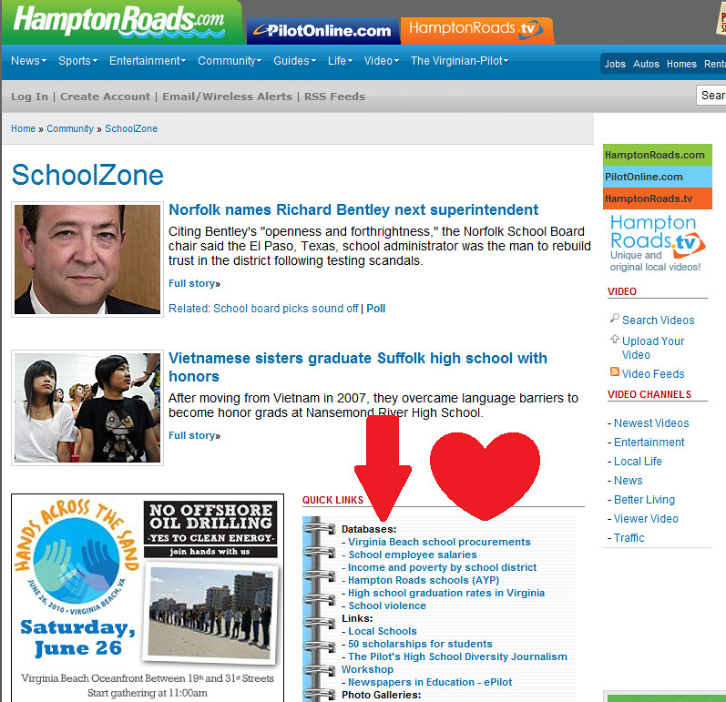
I was reading an article from my local "paper," The Virginian-Pilot, online. When I finished the article I noticed the "Quick Links" just below. To my pleasant surprise, the first category of links was "Databases." Truth be told, I'm not that surprised to find data at The Pilot, but what unfolded when I followed that link was far from the norm when it comes to online (local) journalism and data.

Pilot_Databases_QuickLink


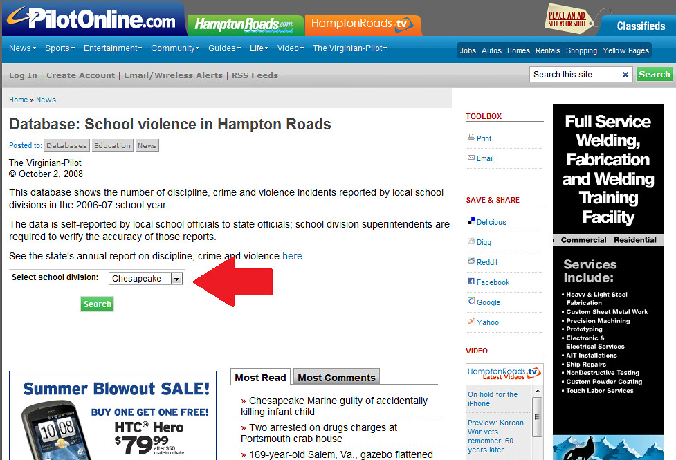
I clicked the link to "School Violence" and found the following page. If you look closely you will see there is a form:


Pilot_Databases_Form


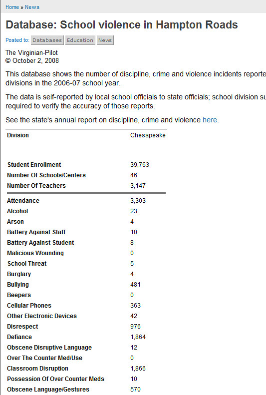
Clicking "Search" took me to this next page. I was not surprised to see that the results were available in HTML only:


Pilot_Databases_Example

Whenever I come across data like this the first thing I want to know is whether or not it can actually be used as data. In order to be used/usable as data the contents of this HTML table need to be, at minimum, copy-and-paste-able into a spreadsheet.

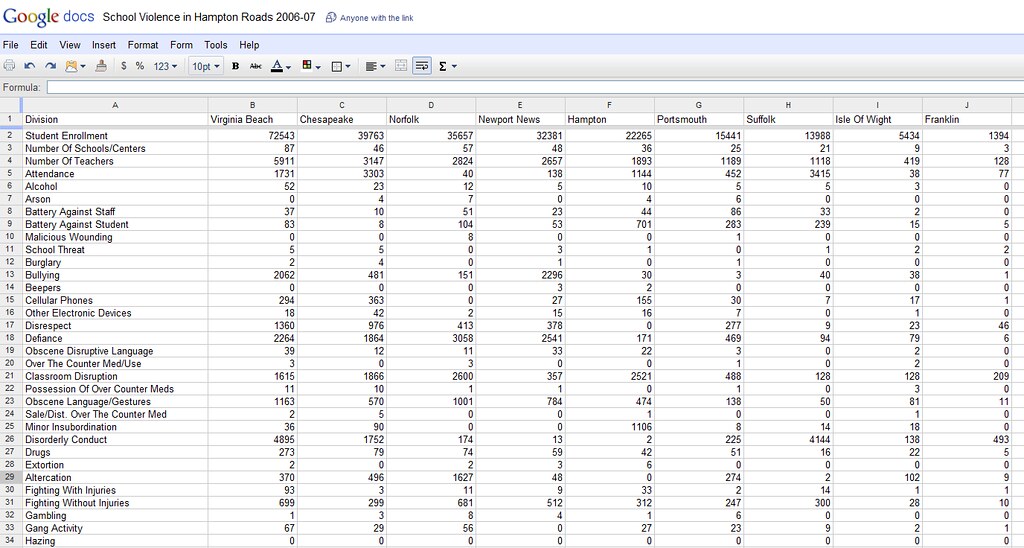
Lo and behold... In about 20 minutes I had pasted all of the contents of the database into a Google spreadsheet:

Pilot_Databases_Google_Spreadsheet

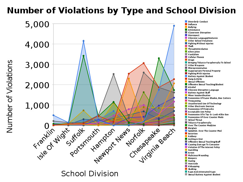
From there I was able to create a few transformations of the data and about a half-dozen meaningful charts like this:
number_of_violations_by_type_and_school_division

What if more news organizations published databases? What if journalists had a habit of digging into those databases with with these simple tools? Would we create better news products? Would we become more accurately and insightfully informed as citizens? Would our governments, businesses, and civic organizations make wiser strategy and better decisions? And if we think that the answer to any of these questions is yes, how do we sustain the "model?"

Friday, June 12, 2009

The Mr. Miyagi School of Software Engineering

This is a re-post from a journal entry I originally wrote over on Slashdot in 2004.  I've made some minor changes and updates for this entry.


Background:  This was an concept born out of necessity about 5 years ago.  I needed a way to train someone with very little experience to work with Bridgeworks but I couldn't afford to spend hours and hours of my own time working with him; too many of my own responsibilities and deliverables.  It was very successful and now he is our best Bridgeworks app developer.  Fast-forward to today when I'm interviewing CS students from a local university for a summer internship.  This is a (well) paid position for which I need someone with decent coding skills who is a self-starter.  Unfortunately none of my candidates have any practical skills whatsoever.  (I don't know what the universities are teaching, but it's not what we need in industry.)  With these candidates it would be like starting from square one.  Obviously I'm not going to pay what I'm willing to pay for people who don't have the quals.  I am willing to train such a person as an unpaid intern, but that is not without its catches.  I still don't have the time to spend hours and hours with these folks.  Furthermore, ethically, unpaid internships are intended for the sole benefit of the student.  My company should not benefit in any way from the labor of unpaid interns.  Practically speaking, though, you can't train someone without giving them tasks.  Re-enter the Mr. Miyagi School of Software Engineering.


Lessons on how to train a junior programmer:


Let's call him Danielsan.


Mr. Miyagi was a very wise and clever sensei. His methodology, loosely translated, is perfect for any small software company that is bringing new developers into the system. The reason Mr. Miyagi's method works so well is because it provides intense, immersive exposure to the most important lessons while demanding relatively few additional resources from the instructor(s). Think about it. While Danielsan was busy painting the fence and sanding the deck, Mr. Miyagi was out having the time of his life!


The length of each lesson is to be determined on a case by case basis.


Lesson 1: Write SDK Documentation


Even the best developers can be notorious for not adequately commenting their code. Good documentation of an software includes both programmer's notes and comments for automated documentation (e.g., doxygen). This oft neglected task is perfect for Danielsan. An excellent way for him to learn the software from a developer's perspective is to write the documentation that explains how it all works.


Listen carefully when Danielsan asks questions about the existing code base. Discourage him from asking too many questions, except regarding complex concepts. It is important that Danielsan develop his own understanding of algorithms, relationships, dependencies, etc.


Lesson 2: Build Company Demos


Documenting the code shows Danielsan how the software developer sees things. Danielsan also needs to see the software from users' perspectives. "Users" include programmers who develop applications from the software and end users of the applications that are developed. Ideally, these would be two separate lessons. Knowing that time and money are always issues, these lessons can be condensed into one by having Danielsan build the company demos.


Architects and senior engineers loathe building company demos. While they are often happy to write test apps for in-house use, company demos bring with them a mountain of maintenance headaches and customer support issues. Whether or not your company is big enough to have it's own department(s) for maintenance and support, it's worth putting Danielsan to work on company demos so he can get his hands a little dirty and see first hand the challenges facing maintenance and support team(s).


Lesson 3: Clean House


Many companies have coding standards that must be followed by all code writers. These standards help everyone to write clean, consistent code that everyone can understand. Unless you work at a sterlized laboratory, it's a safe bet that your house always needs cleaning. A great way for Danielsan to learn this important lesson and also develop habits that are consistent with the team is to set him to work checking for adherence to company coding standards, leaks, potential security issues and the like. It's also a convenient way for you to get your code checked by a fresh pair of eyes.


The Successful Sensei


The successful sensei will know that these lessons are not opportunities for him to relax his own standards or to set Danielsan to work unguided. The successful sensei practices what he preaches. He knows which lessons Danielson must learn on his own and which require guidance. Naturally, Danielsan may occasionally bemoan his instruction. Perhaps he will consider that his training is too rote or mundane. Since you can't just throw a bunch of karate maneuvers in his face to show him what he's learned, it's important to sometimes let Danielsan work on things he finds interesting and fun. Ask him to write stand-alone utility apps that your company might need. Give Danielsan isolated new tasks within the SDK, perhaps something that requires he work with others to design interface requirements, resource requirements, etc.


to be cont'd.


Axiom 1: Tooltips are better left on.


If you leave your tooltips on, chances are better that you will learn something new each time you use your application(s). For Danielsan, tooltips are especially useful when they instruct him about fundamental principles of programming, those that transcend applications.


Axiom 1a: Some tooltips are better than others.